
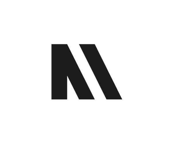


INTRODUCING OUR PRIMARY, SECONDARY AND BRAND IDENTITY LOGOS.
OUR REBRAND HAS BEEN DONE BY STUDENTS FROM YEOVIL COLLEGE IN THE UK.
Ben Mitchell who did the final designs is the most talented, up and coming professional graphic designer we have had the pleasure to work with. Ben’s work ethic is second to none, he has worked very hard in meeting deadlines for us in an extremely fast pace environment. Ben has also dealt with us as clients in a very professional manner and comes across very passionate about the design industry.
We are already working with Ben on other projects and we know he is going to be much in demand for his design services in the near future.
We would like to thank Ben for his hard work and in elevating our brand to the next level.
We would also like to thank everybody who was involved with our rebrand project especially Adrian Ponter, Curriculum Area Manager of Creative Industries at Yeovil College for making this all possible.
After all the hard work we have put into cohesive brand design, we are pleased to say we are now ready to reveal our new brand identity.
Mixmania Records core value is to empower creators.
Being family orientated with positivity and happiness, working in a non-blame environment, having dignity and respect, focusing on self-improvement, having a default to transparency and we always aim to do the right thing.
What is the most important thing to the Mixmania Records brand?
An optimistic, passionate respect for life and the things that really matter.
What will we never compromise on?
Quality, craft, creating opportunities, generosity, pleasure, friendship, cultural identity, authenticity.
What are the tangible components of our music?
Quality sound, quality production, groove, melody, harmony, rhythm and a truly personal experience to the listener.
Colours.
We have also carefully selected colours, colours that have meanings and that we believe will represent our brand to its full potential.
Black: power, elegance and formality.
Dark Grey: dignified, conservative, and carries authority.
Light Grey: power, balance, calm, soothing.
Dark Blue: trust, dignity, intelligence and authority.
Light Blue: peace, serenity, ethereal, spiritual, infinity.
White: awakening openness, growth and creativity.
Keeping consistent.
We also wanted to make sure that, our brand identity stays the way it heads out into the world, so we worked really hard on writing out full branding guidelines to ensure our logos are used in a way that upholds aesthetic standards and keeps our brand looking professional and consistent.
Our Next Release.
Rhys Franklyn who is studying graphic design at Yeovil College has also been working with us on some album artwork designs. Rhys has been the very first graphic designer to be implementing our new branding guidelines and we have all been really impressed with what Rhys has come up with, which is an outstanding design for our next release and in our opinion it’s by far the best album artwork we have had done by any graphic designer we have used.
Thank you Rhys for your hard work and meeting our very tight deadlines.
Our next release is out on the 28/7/17 and is available to pre-order 21/7/17 from Traxsource.
Caribeat By Dj Ease is available as a free download from our website.
 By Dj Ease Art Work")